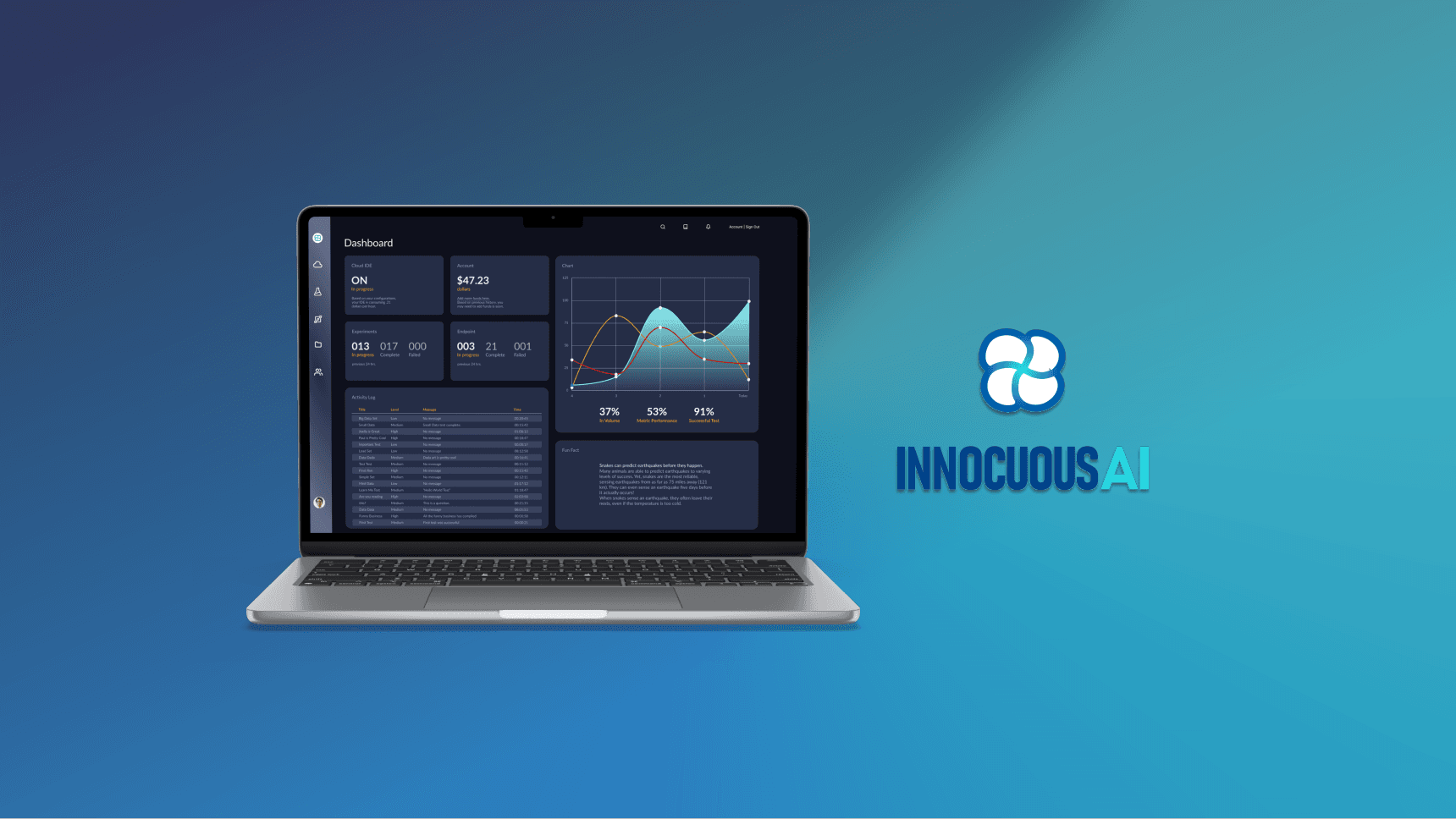
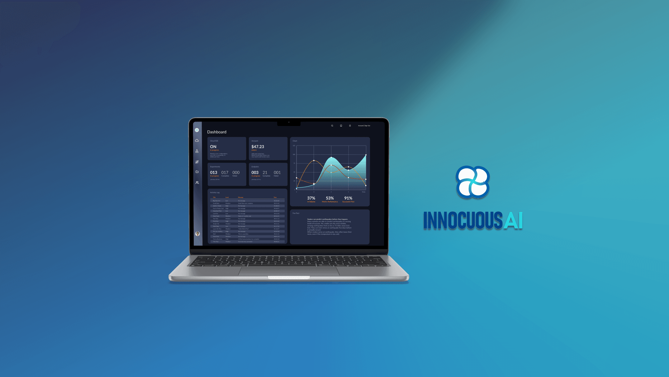
Innocuous AI
Cloud Platform (SaaS) Redesign | UX Optimization | Branding
Industry
Software Development
Platform
Web | SaaS
Project type
Client (Contract)
Timeline
3 weeks
Role
UX/UI Designer, Lead Researcher
Tools
Figma | Maze | Photoshop | Google Workspace
Methodologies
User Flows | Heuristic Evaluation | Competitive and Comparative Analysis | User Interviews | Contextual Inquiry | Affinity Map | User Persona | Sketching | Prototyping | Usability Testing | Design System
Innocuous AI is a DevOps platform that allows data scientists to configure, create, and deploy experiments and models on the cloud.
The founders approached our team to refine and enhance the design. Our goal was to create a more user-friendly platform with a fun, game look and feel.
We developed a comprehensive design system, prototyped two main processes and focused on addressing UX issues while improving the interactive experience. Our redesign offers users a seamless and visually appealing experience on a more intuitive platform.
Insightful foundations: Heuristic evaluation and interviews head the redesign
As the lead researcher on this project, I outlined a plan that included creating user flows, conducting a heuristic evaluation, competitive and comparative analysis, and diverse interview approaches. Among these methods, the heuristic evaluation and interviews provided the most valuable insights, shaping the redesign of the platform.
Lack of user control and error prevention
On the experiment summary page, users are unable to go back and edit if they notice an error. Clicking the 'Edit' button takes them back to the beginning, and there is no prompt to prevent the loss of all selections made during the experiment or endpoint creation.
Lack design consistency and standards
Red serves as both an accent color and in cancellation actions across the platform. Applying red to the GPU selection may inadvertently convey unintended meanings to users.
Confusing visibility of system
When creating an experiment, the progress bar skips the 'Recipe' step, potentially causing confusion for users who cannot see the completion status of that step.
Out-of-date help & documentation
The documentation linked on the platform is outdated; users need to visit the company website to access the latest information.
Heuristic evaluation insights
The platform severely violated five main principles. Shown above are instances of violations that rated 3 to 4 on a 4-point severity scale. These violations were a result of:
inappropriate use of red
inconsistent design
unclear progression and lack of user control
loss of progress, and
out-of-date documentation.
Interview approach & insights
We used the following three interviews approaches to gather essential insights on industry, users, and the platform:
Industry interviews - to enrich our knowledge base on the users and process this platform is to serve.
Pre & post-onboarding interviews - to evaluate the user experience and usability of the platform.
Contextual inquiries - to observe and identify pain points that were directly related to the platform.
We treated these responses as suggestions for the redesign and implemented all that were applicable with the features currently available on the platform.
Industry interview
Comment on UI preferences
"I think it depends, but I know I like dark [mode]. Sometimes I'll switch depending on the program I'm using"
Insight: Light and dark mode preferences vary. Users prefer dark backgrounds when working individually and light backgrounds when sharing.
Contextual inquiry
Comment on platform's ease-of-use
"I would expect to see here a description of the function is and what the model is in experiments."
Insight: Data science processes require context. Users need thorough and accessible documentation.
Post-onboarding interview
Feedback on process flow & function
"… it all depends on company and project… you know, as long as it works for that particular project"
Insight: There is no common workflow between all data scientists. User control and flexibility is essential.
Solution exploration: Strategizing our design solutions
Building on our initial research and insights, we progressed to brainstorming potential solutions, all centered around the same focal point of the problem statement.
Users need a fun, interactive platform with consistent design standards along with supporting guidance so that they can more easily and confidently use the platform.
Sketching intuitive and playful interfaces
We composed several sketches of the interfaces that demanded significant redesign, with our primary focus on enhancing the dashboard and refining the Cloud IDE configuration board. Based on research we found that an operational dashboard would best suit the needs of our users as it would allow them to quickly monitor their experiments, configurations, and related costs. While the Cloud IDE's configuration board layout worked well, we wanted to infuse a more playful and game-like touch into the inputs.
Dashboard Sketch
Highlighting one of Innocuous AI's strengths—cost transparency—I made sure users could easily monitor their expenses. I also included fields to keep users informed about the status of their projects.
Cloud IDE Board Sketch
I aimed to maintain the structure of the configuration board since the flow was effective. However, I transformed the inputs into geometric shapes to introduce a playful element, especially when animated.
Prototyping & testing our design solutions
To evaluate the impact of our modifications, we created five tasks and tested the redesigned interface with six users.
The user flow proved to be intuitive with a 100% success rate across all tasks. However, valuable insights surfaced regarding the placement of the power switch on the Cloud IDE page.
Originally in the upper left-hand corner, users found the placement confusing, leading to an 81.2% misclick rate, as observed in the heatmap. Incorporating this feedback, we considered the user experience in the development of the high-fidelity prototype.
Crafting the experience: developing a branded, hi-fi prototype
We took care in crafting Innocuous AI's unique identity, aiming for a fun platform feel as the founders envision. Drawing inspiration from platforms like Discord, we developed a techy, vibrant UI and prototyped two of the platform's process flows.
Key features of the redesign
Operational dashboard
"A dashboard is a digital display of data used to monitor conditions and/or facilitate understanding." - Big Book of Dashboards
Our goal was to create a clear, concise visual display that would enable users to effortlessly monitor essential metrics. We structured the information layout in accordance with the natural eye scanning pattern of left to right and top to bottom. To ensure users immediately make note of the most crucial information, we strategically positioned it in the upper, left-hand corner.
Configuration board & tooltips
We utilized 3D shapes and icons to make the configuration board more engaging and interactive. However, we added dropdowns as an alternative, accessible option for users.
Simplicity is a key advantage for Innocuous AI. Our goal is to enable users to navigate the platform seamlessly without frequent reliance on documentation. To enhance user efficiency, we integrated tooltips offering helpful information at critical points.
Document preview
Innocuous AI recognized that data scientists prefer to code locally, because of this they wanted the platform to look and feel as if they are working on their desktops. This feature allows users to quickly view a document without having to download it first. The preview would allow users to perform tasks more efficiently and enjoy a natural workflow.
Autosave & progress bar
To safeguard user progress, we introduced both periodic and manual AutoSave feature. Users can now leave and return at their convenience without fearing data loss. We improved user control and navigation by enabling smooth transitions between different sections using the progress bar.
Updated navigation bar
We reimagined the navigation and added an crucial function - users can now pause all activities with a single click of a button.
Light & dark mode
Prolonged exposure to a bright screen can be a strain on the eyes; however, it is necessary while presenting or sharing screens. Due to demand for both light and dark screens, we gave users the flexibility to choose the display mode that best suits their needs or preferences.


